Most brands send all their traffic to the same landing page and then wonder why conversion tanks. The fix isn't a new headline or a better hero image. It's matching your landing page strategy to where visitors actually are in their journey, from cold traffic that needs education to warm visitors who are ready to buy.
This guide is for operators running 8-9 figure DTC brands and managing landing page programs across multiple paid channels. It gives you the exact framework for aligning landing page strategy to each stage of the buyer journey: which page formats work, what copy hierarchy to use, and how to measure success at each stage.
The 4-Stage Landing Page Framework
The buyer journey maps directly to four landing page strategies. Get the match right, and your pages work with visitor psychology instead of against it. Get it wrong and even great creative and solid media buying can't save your conversion rate.
Generic awareness models don't translate to page decisions
We don't actually think in terms of "unaware, problem aware, solution aware, product aware" when we're mapping pages to journey stages. That's a copywriting model, not a CRO model.
What actually matters is traffic intent and the specific question a visitor is trying to answer when they arrive on your page. A cold Meta visitor is asking, "Do I even have this problem?" A Google Shopping visitor is asking, "Which product solves it best?" Those are completely different pages, and generic awareness models collapse those distinctions into vague funnel stages that don't help you make real decisions about page format, copy hierarchy, or CTA placement.
The traffic-intent model that actually converts
Traffic source is the fastest proxy for the buyer stage, and it's the signal you should use to route visitors to the right page format. Here's how it breaks down in practice:
Stage 1 (cold / problem aware): Meta, broad paid social → Advertorial or listicle landing page
Start with the traffic source, then refine with on-site behavioral data as you get more sophisticated.
Stage 1: Cold Traffic Landing Pages
Cold traffic doesn't trust you yet, and sending them to a product page is why your Meta ads tank. At Stage 1, visitors aren't looking for your brand or your product. They're trying to understand whether they have a problem worth solving. Your landing page has one job: create a pattern interruption that moves them from passive scrolling to active interest.
Why PDPs kill cold conversion
A product detail page assumes the visitor already wants what you sell. It leads with the product name, price, and features, all of which are meaningless to someone who hasn't yet connected your product to their problem. Advertorials and listicle landing pages lead with the problem, which is exactly where a cold visitor's attention already lies.
Switching cold paid social traffic from PDPs to problem-first advertorials or listicle formats has produced significant conversion lifts for brands running this test. The page format change alone, before any copy optimization, is often the biggest lever available to brands spending heavily on Meta or broad social.
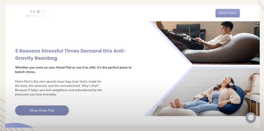
Moon Pod doesn't try to sell a bean bag chair on its landing page. It highlights a problem (stress and the need to relax) and lets the product emerge as the natural solution. That's Stage 1 done right.
Ground your cold traffic copy in customer language
Before writing a single word of cold traffic copy, ground your messaging in actual customer language, not internal product descriptions. We build cold-traffic pages based on research with existing customers: how they describe the product changing their lives, what finally made them buy, and what hesitations almost stopped them. Layer in which ad angles are already winning in paid, and you've got both the language and the structure for a page that converts cold visitors.
The copy that comes out of this process feels immediately relevant to a cold visitor because it mirrors their internal monologue, not your brand messaging deck.
Delay your CTAs until conviction is built
For cold traffic, placing buy buttons too early kills conversion. A visitor who hasn't yet accepted that they have a problem will not respond to a CTA in the first scroll. People click before conviction is built, and when they land on a product page without context, they bounce. Structure your cold traffic page so the product emerges as the natural conclusion to a story, not the opening argument.
Cold traffic pages can run 2,000 words or more if structured as scannable listicles. Length isn't the enemy of conversion at Stage 1. Premature selling is. Each section should answer the next logical question a skeptical visitor would have, pulling them deeper into the page before the CTA appears.
Stage 2: Solution-Aware Landing Pages
Solution-aware visitors are comparing options, and your page hierarchy determines whether they pick you. At Stage 2, visitors already know they have a problem and know solutions exist. They're evaluating which one is right for them. Your landing page needs to win that evaluation, not re-explain the problem.
The 7-part hierarchy that converts evaluators
Solution-aware visitors respond to a page structure that aligns with their evaluation mindset. This is the single-product landing page hierarchy we use, and the order matters:
What am I buying? A clear hero that shows the product and states the outcome, not the product name. For hero section structure specifically, see (link to Hero Section Guide).
Is this for me? Relatability and self-selection. The visitor should see themselves reflected in this section through customer profiles, use cases, or "this is for you if" language.
Why should I care? Pain points and outcomes, not features. This is where you bridge the problem to the product by showing how their life changes.
How does it work? The unique mechanism, explained in plain language. This is what separates you from every other product that claims the same benefits.
Why trust you? Social proof, customer results, press, and credibility signals. Numbers beat star ratings because "43,000 subscribers" is something you can picture and "4.8 stars" isn't.
Why you vs. alternatives? Only include this if competitors are actively in the visitor's consideration set. Don't introduce doubt by naming competitors the visitor wasn't already comparing.
How do I buy? An irresistible buy box that removes every remaining barrier. Price, guarantee, shipping, and a clear CTA.
Depth wins for educated buyers
A common mistake at Stage 2 is over-summarizing, and for educated buyers, it's a conversion killer. We've watched conversions drop when PDPs and landing pages get shortened for audiences that actually want depth: older demographics, considered-purchase categories, and anyone who's already done preliminary research.
Marketers assume shorter pages convert better, but for buyers actively evaluating options, brevity reads as evasion. If your page doesn't answer the questions they're carrying into the session, they'll find a competitor page that does.
Depth signals confidence. A brand that explains exactly how its product works, what it won't do, and how it compares to alternatives earns more trust than one that hides behind vague benefit statements. Stage 2 pages should be comprehensive, not padded. Every section should answer a real evaluation question.
Competitor comparisons: only when they're already looking
Include competitor comparison sections only when your traffic data confirms visitors are in active comparison mode. "Best [category]" search traffic and late-stage retargeting audiences justify comparison content. Early retargeting audiences may not yet be comparing, and introducing competitor names prematurely can create doubt rather than resolve it.
When you do include comparisons, lead with benefits rather than feature checkboxes. A feature-driven comparison chart tells visitors what your product has. A benefit-driven comparison shows them what their life looks like after choosing you rather than the alternative. That's the difference between information and persuasion.
Stage 3: Product-Aware Pages
Your homepage isn't a billboard. It's a router that should push visitors down the path with the highest conversion rate. Stage 3 visitors know your brand and are browsing to find the right product. The job of your homepage and collection pages is to efficiently route visitors to the product most likely to convert, not to impress them with brand storytelling.
The Best Path to Purchase framework
Use GA4 page path analysis, Shopify analytics, and heatmap data to identify which homepage interactions actually lead to purchases, then redesign your homepage to make those paths the default experience. Most brands discover that a small number of entry points drive the majority of conversions, and their homepage is burying those paths under brand content.
Revenue-per-click heatmaps add another layer: they show not only where visitors click, but also which clicks generate revenue. A hero image that gets 40% of clicks but drives 8% of revenue is a conversion liability, not an asset.
This homepage routing logic also drives some of the largest revenue lifts we've documented across client engagements. Monthly lifts in the 6-figure range have come from beauty, fragrance, fashion, and apparel brands that have restructured their homepages around the highest-converting paths rather than brand presentation.
Your popular product probably isn't your acquisition product
Popularity and acquisition value are not the same metric, and confusing them is one of the most common Stage 3 mistakes. Your best-selling product by volume may not be the product that drives the highest long-term customer value. Use LTV-weighted first-purchase data from Shopify analytics to identify which products actually build your customer base. These are your acquisition products, and they should anchor your Stage 3 landing page strategy.
Brands that optimize homepage and collection page prominence for LTV-weighted acquisition products consistently outperform those that optimize for raw sales volume. The product that acquires the best customers is the product worth featuring most prominently for Stage 3 traffic.
Collection page optimization for browsers
Collection pages serve Stage 3 visitors who are browsing within a category but haven't selected a specific product, so optimize them for filtering, sorting, and comparison, not for brand storytelling. Every element that slows the path from "browsing" to "selected product" is a conversion leak.
Prioritize clear product hierarchy, benefit-led product titles (not just product names), thumbnail images that communicate differentiation at a glance, and filtering options that match how customers actually think about the category. If your visitors think in terms of "for oily skin" or "under $30," those should be filters, not something they have to scroll past brand stories to find.
Stage 4: Decision-Stage Optimization
At checkout, the wrong optimization can kill conversion, but for some products, adding friction actually lifts it. Stage 4 visitors have made their decision in principle. They're executing a purchase. The primary risk at this stage is distraction, doubt, or friction that interrupts execution.
When adding friction increases conversion
For most products, removing friction at checkout is the right move. But for considered purchases, a small amount of structured friction can increase conversion by making customers feel their purchase was personalized and deliberate. Health and wellness products, skincare, supplements, apparel with sizing complexity, anything where fit matters: these are all categories where customers convert better when they feel the product was chosen specifically for them.
Quiz funnels are one of the reliable forms of conversion-positive friction for considered purchases. The act of answering questions makes customers feel the resulting recommendation was built for them, which reduces post-purchase doubt and increases completion rate. This is counterintuitive, but it's client-tested across multiple categories.
The key distinction is this: friction that helps customers feel confident in their choice increases conversion, while friction that creates uncertainty or requires effort without payoff kills it.
Quiz funnels for considered purchases
Structure quiz funnels to ask only questions that change the recommendation. Every question that doesn't affect the outcome is friction without benefit. End with a specific product recommendation that references the customer's answers ("Based on your skin type and your sensitivity concerns, we recommend [product]") because that outperforms generic "here's our bestseller" recommendations every time.
Trust elements that actually matter at checkout
Not all trust elements perform equally at Stage 4, and using the wrong ones can actually reopen the evaluation you've already won. Visitors at checkout aren't evaluating whether to trust your brand. They've already cleared that bar. They're managing last-minute anxiety about the transaction itself.
The trust elements that matter here are transactional: secure payment badges, a clear return policy, a shipping timeline, and a money-back guarantee. Remove trust elements that reopen evaluation questions, such as competitor comparisons, "why us" sections, and feature lists. Those belong at Stage 2.
The thread that ties all four stages together: customer language
The words on every page have to come from real customer language, not internal assumptions, and this is the single thread that connects all four stages. You can come up with five great reasons why someone should buy your product, but if those reasons are written in agency language, they won't convert. Swap them for the exact phrases customers use in surveys and reviews, and the page becomes hyper-relevant. Relevance is what makes people read to the end.
Mining reviews and surveys for conversion copy
Start with your highest-volume review sources and look for three recurring narrative moments: the problem before purchase, the moment of decision, and the outcome after use. Those three moments map directly to the copy needs for Stage 1, Stage 2, and Stage 3. Pull exact phrases and test them as headlines, subheads, and benefit bullets.
Then survey your recent customers with one question: "What almost stopped you from buying?" The answers are your objection-handling copy for Stage 2 and Stage 4 pages. This is the highest-ROI copy research you can do, and most brands skip it entirely in favor of internal brainstorming sessions that produce polished copy nobody resonates with.
The relevance test that predicts page performance
Before publishing any landing page, run the relevance test. Read the first three seconds of your page (headline, subhead, hero image) and ask whether a visitor arriving from your primary traffic source would immediately recognize that this page is for them.
If the answer requires any mental translation, if the visitor has to work to connect your opening to their situation, your page will underperform.
Relevance isn't about personalization technology. It's about copy and creative that speaks directly to the specific visitor arriving from a specific source. A cold Meta visitor should see their problem reflected back at them. A Google Shopping visitor should see the product they searched for. Relevance at the top of the page is the single highest-leverage optimization available before any A/B testing begins.
Before you invest in journey-stage personalization
Don't jump to per-stage personalization until the basics work. There's an optimization maturity ladder, and most brands try to skip rungs:
Nail your offer and product-market fit
Lock in your core value proposition
Find the top-performing page format for each channel
Identify the 20% of your audience driving 80% of your results
Make sure every product has a dedicated page
Test those pages
Then experiment with stage-level personalization
Brands at $100M+ often haven't gone beyond step six, yet they're performing well. Per-stage personalization multiplies your testing surface area, which means more pages to maintain, longer to reach statistical significance on any individual test, and more edge cases to manage. Most teams don't have the bandwidth to do it well.
Optimize your highest-traffic stage first, get one stage to a conversion rate you're confident in, then apply the learnings to the next stage. Sequential optimization beats parallel experimentation for most teams.
Measuring success by journey stage
Conversion rate isn't the right primary metric for every stage, and measuring all stages with the same KPI leads to misleading optimization decisions. Each stage has a different success condition.
Stage 1 (Cold Traffic): Engagement rate, scroll depth, micro-conversions such as email captures and quiz starts. Purchase conversion rate is a lagging indicator for cold traffic. Optimize for engagement first.
Stage 2 (Solution Aware): Time on page, scroll depth past objection-handling sections, and add-to-cart rate. These signal whether your depth and hierarchy are working.
Stage 3 (Product Aware): Pages per session, add-to-cart rate, product detail page reach rate. Measure how efficiently your routing is working.
Stage 4 (Decision): Check out completion rate, AOV, return rate. At this stage, purchase metrics are the right primary signal.
Frequently Asked Questions
How do you migrate from a flat landing page program to a journey-stage-aligned one when you already have 30+ pages running?
Don't migrate all at once. Audit your current pages against the journey-stage framework and identify which pages are most badly misaligned. Typically, that means cold traffic landing on PDPs, or warm retargeting hitting cold-audience advertorials. Fix those first because they're producing the highest CAC inflation right now. Once the worst misalignments are corrected, work through the remaining pages in priority order based on traffic volume. Most brands can complete the migration in two to three quarterly cycles without disrupting in-flight campaigns. And treat in-flight tests with care: pages currently running experiments should complete those tests before being restructured for journey-stage alignment.
How should journey-stage landing pages integrate with the broader CRO testing program?
They shouldn't run as a separate program. Journey-stage landing pages are part of the broader CRO testing roadmap, prioritized alongside site-CRO tests using the same scoring framework. The mistake to avoid is treating landing page CRO and site CRO as separate disciplines with separate teams. They share the same research base, the same brand strategy filter, and the same testing methodology. For the broader methodology this sits on, see (link to CRO Audit article).
When does journey-stage personalization make sense vs. journey-stage page selection?
Page selection (routing traffic to different static pages based on source and stage) is the right starting point. Personalization (dynamic content within a single page that adapts to inferred stage) only makes sense when you've exhausted the wins from page selection and have the operational maturity to maintain a dynamic content infrastructure. Most 8-9 figure brands get more value from page selection because the operational cost of personalization compounds with every variant you add: more maintenance burden, more testing complexity, more edge cases. Page selection wins almost always pay back faster.
How do I know which journey stage my traffic is in?
Look at the traffic source and search intent. Cold Meta traffic is Stage 1. "Best [product category]" searches are Stage 2. Branded searches and Google Shopping are Stage 3. Cart abandoners and email retargeting are Stage 4. Traffic source is your fastest and most reliable signal.
How long should each landing page be?
It depends on the buyer's stage. Cold-traffic pages can run 2,000 words or more if structured as scannable listicles, because length isn't the enemy; premature selling is. Solution-aware buyers in Stage 2 actually convert better with depth and comprehensive objection handling. Don't over-summarize for educated buyers.
What metrics should I track for each journey stage?
Stage 1: Engagement rate and micro-conversions. Stage 2: Time on page and scroll depth. Stage 3: Pages per session and add-to-cart rate. Stage 4: Checkout completion rate and AOV. Using the purchase conversion rate as the primary metric for Stage 1 and Stage 2 pages produces misleading optimization decisions because those pages rarely produce the final conversion touch.
If you're running an 8-9 figure DTC brand and your landing page program isn't aligned to buyer journey stage, or you suspect your CAC is inflated by mismatches between traffic source and page format, see how we can help you.


.jpg)
