Mobile drives 59% of e-commerce revenue globally and nearly 80% of retail visits, but desktop still converts at roughly 1.7x the rate of mobile. That gap is where the money leaks. You're paying for mobile traffic at desktop rates and watching most of it bounce before it ever hits the cart.
Mobile CRO is how you close that gap, and it's a discipline of its own. Let me walk you through what we've seen work for our clients: the data to pull, the seven changes that most reliably lift mobile conversion rates, and how to run a mobile CRO audit that surfaces what's costing you sales.
What is mobile conversion rate optimization (CRO)?
Mobile conversion rate optimization is the work of turning mobile visitors into customers on a small screen, often a slow connection, and with a fraction of the attention they'd give a desktop browser.
Everything plays into it: your hero image, your headline, your load speed, your checkout form, your payment options, your CTAs. Get any of these wrong on mobile and you're not just losing the first sale, you're losing the chance to bring that customer back.
Mobile shoppers are the bulk of repeat traffic for most DTC brands now, with 29.9% of internet users worldwide making a mobile purchase every week, so a clunky experience compounds across every visit, not just the one.
Why mobile CRO needs its own approach
Mobile is not a smaller desktop, and treating it like one is the single most expensive mistake I see DTC brands make.
Have you ever tried to buy something on your phone and given up because the form keyboard kept covering the field you were filling in, or the page took so long to load you forgot what you came for? The friction we tolerate on desktop becomes a dealbreaker on mobile, and the data backs that up.
The gap is still wide in 2026. Across major benchmarks, desktop converts at roughly 4.8% while mobile sits around 2.9%, and during the 2024 holiday season Adobe clocked Cyber Monday at a 7% desktop conversion rate against 4.6% on mobile. Mobile owns the traffic, but desktop still owns the close.
The flip side is that mobile gives you things desktop can't. First-party data from app installs, location-aware experiences, push notifications, and one-tap payments.
Brands that treat mobile as its own design problem instead of a desktop afterthought are the ones closing that conversion gap, and we broke down what good looks like in our analysis of 10 DTC mobile landing pages.
Simply put, mobile is its own job. Treat it like one.
How to increase mobile conversion rates
If your mobile conversion rate is lagging, there's no magic bullet, but there is a sequence. Start with data, fix the foundation (speed, checkout, content hierarchy), then iterate on the levers that move the needle for your specific brand.
1. Collect and analyze data
Before you change anything, you need to know what's broken and where. That means digging into how mobile visitors behave on your site, not trusting your gut on what "feels off."
The tools we use most often:
Google Analytics for bounce rate, conversion rate, traffic source, and device-segmented funnel data.
Heatmap tools like Mouseflow, Clarity, and Hotjar to see where users tap, where they linger, and where they bail.
Session recording tools like UXCam and Heap to watch real users navigate your site and surface bugs that don't show up in aggregate data.
Shopify's analytics dashboard for cart-to-checkout funnel data if you're on Shopify.
Quantitative data alone is only half the picture though. It tells you what's happening, not why. For the why, you need qualitative research, which we'll get to in a minute. First, what to look for in the numbers.
How users engage with your content
A few patterns we look for when we comb through mobile heatmaps and session recordings:
Are they tapping text links instead of buttons? Text links can be effective CTAs, but if a text link is outperforming a designed button on the same page, your button design probably isn't doing its job.
What are they tapping that isn't tappable? When mobile users tap product images, brand logos, or other non-interactive elements, they're telling you what they expect to be interactive. Hint: most of the time, product images should open a larger view.
Are they rage-tapping? Rapid repeat taps on the same element almost always mean frustration, whether that's a slow load, a broken link, a ghost click, or an element that looks tappable but isn't. Fix whichever one it is.
See where we're going? The tap patterns are half the story. Where mobile users go next is the other half.
What path users take
When we audit a mobile site, we map the entire path: how visitors land, what they tap, where they go next, and where they leave.
How do users get to your landing page? Traffic source changes everything about what should be on the page. Advertorials work great with platforms like Facebook, Instagram, or Taboola, but they rarely match the intent of paid search traffic, where users want a direct path to the product. Matching the landing page type with traffic type and intent is one of the highest-impact decisions you'll make.
Where do users go after the landing page? If they're bouncing around your site searching for information, your copy or your offer isn't doing its job on that page.
Where do they leave? Bounces tell you the page failed to engage. Cart abandons tell you something later in the funnel broke trust. Time-on-page spikes followed by exits usually mean the page raised a question it never answered.
Quantitative data gets you to the right questions, but to get the answers you have to talk to your customers. That's where qualitative user research comes in. Usability testing, polls, surveys, and customer interviews are how we figure out what's really going on inside the mobile shopper's head, and how to attract and convert your target customer once you know.
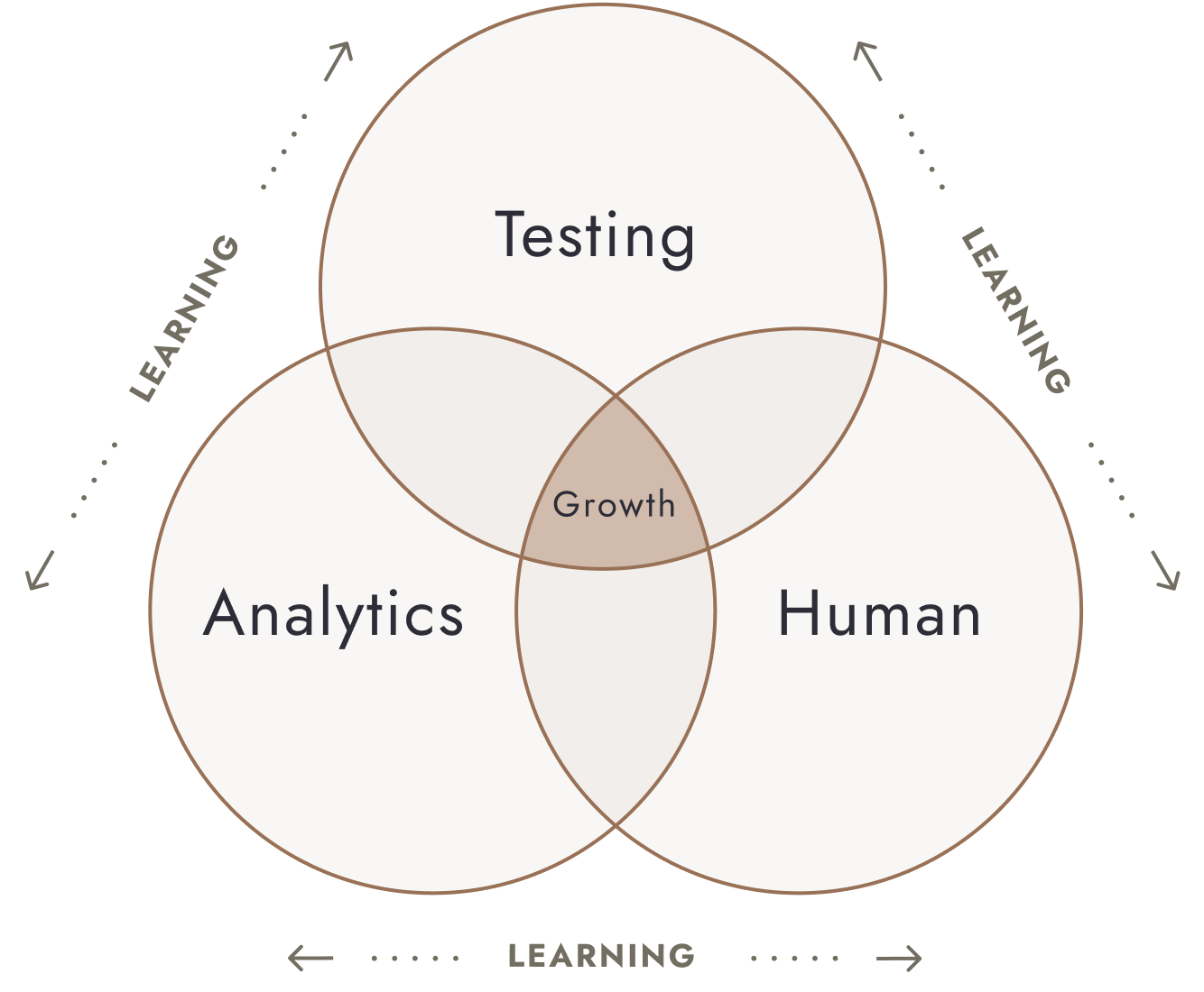
Gather data insights with the Testing Trifecta
The framework we use to bring all of this together is what we call the Testing Trifecta. It pulls insights from three sources: Analytics (quantitative), Human (qualitative), and Testing. Together, they tell us where to look, what to test, and why a test won or lost.
When DTC fashion brand Haute Hijab partnered with us, we used the Testing Trifecta to find the friction points in their funnel and rebuild around what their customers wanted. The result was a 26.8% site-wide conversion lift and an 18% increase in revenue per user.
2. Improve page load times
Speed is the floor everything else stands on. It doesn't matter how strong your offer is if half your visitors leave before the page paints.
Google's own research, still cited widely in 2026, found that 53% of mobile users abandon a site that takes longer than three seconds to load. Every additional second of mobile load time can drag conversions down by up to 20%.
The math is unforgiving. If half your mobile visitors leave before the hero loads, your CRO program never gets a chance to do its job.
When I take on a new client, page speed is almost always the first thing I check, and almost always where the biggest early wins are hiding.
Before you A/B test a single headline, run a Lighthouse audit and fix anything red on mobile: oversized images, render-blocking scripts, third-party tags you don't really need. Speed work is unsexy, but it's the highest-return work we do for most new clients.
3. Simplify registration and checkout
Forms are where most mobile sales die. A desktop form that's slightly annoying becomes a dealbreaker on a phone keyboard, especially when the autofill misses or the page reloads and wipes everything.
A few rules we apply on every mobile checkout we audit:
Cut every field that isn't required to ship the order. Phone numbers for shipping carriers, gift notes, marketing checkboxes. Move them post-purchase, or remove them entirely.
Use the right input types so mobile keyboards default to the right layout (numeric for ZIP, email for email, and so on). It sounds small, it isn't.
Offer express payment above the fold. Apple Pay, Google Pay, Shop Pay, and PayPal collapse the entire checkout into one tap. On mobile, that's often the difference between converting and not.
When you're choosing your full set of payment gateways, the three things to weigh are security and encryption, country and currency support, and how well the gateway plays with mobile wallets. The Shopify gateways we see working best across our DTC client base:
Shopify Payments
Stripe
PayPal
Apple Pay
Google Pay
One warning though: more payment options is not always better. A checkout with five stacked payment buttons can convert worse than one with two or three well-placed options. Always test before you assume.
4. Front-load key content
Mobile users only scroll if you give them a reason to. Nielsen Norman Group's research on mobile UX makes this point repeatedly: visitors decide whether to scroll based on what they see in the first viewport. If that first screen doesn't earn the scroll, they're gone.
That doesn't mean stripping the page bare. It means your value proposition, primary CTA, and one compelling visual all need to live above the fold on a typical mobile viewport (roughly 375 to 414 pixels wide).
A quick test you can run today: pull up your homepage or your top PDP on your phone, take a screenshot of just what's visible without scrolling, and show it to someone who has never seen your brand. Ask them to tell you what you sell and why they should care. If they can't, you're losing visitors in the first three seconds.
Heatmaps are how we verify this in practice. If your scroll heatmap shows a sharp drop-off in the first 600 pixels, your above-the-fold content isn't earning the scroll, and it's time to revisit it.
5. Design clear CTAs
A good mobile CTA does two things: it's visible at a glance, and it tells the user exactly what happens when they tap it. Mobile visitors don't read CTAs, they scan them. Generic copy like "Click Here" or "Submit" wastes that chance.
Compare:
"Be the first to know about new arrivals" is concrete, action-oriented, and tells the user what they're signing up for.
"Click here" tells them nothing.
On visual design, color matters less than people think. We see a lot of operators waste cycles A/B testing button color (green versus red, etc.), and for most brands it's a waste of time. What matters is whether the CTA passes the squint test: lean back from your screen, squint, and see if the button still stands out from the page. If it does, you're fine. The bigger wins almost always come from the words, not the hex code.
6. Gain consent to gather user data
Customer trust is a conversion lever now, not a compliance afterthought. Privacy concerns shape what mobile shoppers will share, what they'll buy, and whether they'll come back.
Deloitte's 2024 Connected Consumer Survey found consumers are more wary than they were two years ago, with privacy and data-use concerns now a leading reason people abandon apps and limit how much information they share with brands.
The brands winning on mobile are upfront about what data they collect, what they use it for, and what the customer gets in return. That can be as simple as a one-line note next to a form: "We use this to send shipping updates and personalize the products you see. We don't share it." Specific, plain, no legalese.
Trust compounds. Customers who feel safe sharing data come back more often, refer more, and convert higher on every subsequent visit.
7. Design for thumbs, not cursors
Ever tapped a mobile button and accidentally hit the one next to it? That's a design failure, not a user error.
The single most common mistake I see on mobile is sites that were designed for cursors and then squeezed onto a phone. Hover effects that never trigger. Tap targets too small for a thumb. Multi-column grids that force horizontal scrolling. Sticky elements that cover the CTA when the keyboard opens.
A few mobile-first patterns we test into almost every client site:
Touch targets of at least 44 by 44 pixels, with enough spacing between them that users can't accidentally tap two at once.
A sticky add-to-cart button on PDPs that follows the user as they scroll. The longer the page, the more this matters.
Single-column layouts for most of the page. Side-by-side content on mobile almost always reads worse than stacked content.
No hover-dependent menus or interactions. If a feature requires a hover state to access, mobile users can't access it at all.
These are foundational UX choices that won't show up in a single headline test, but they shape the ceiling of every test you run after them. Fix the foundation first, then optimize on top of it.
How to conduct a mobile CRO audit
A mobile CRO audit is how we figure out what's costing you sales on mobile and what to fix first. Audits also help you quantify the ROI you could see by improving mobile CRO before you commit to a full optimization program.
1. Choose which conversion metrics to track
Not every brand needs to track the same metrics. For ecommerce, the ones we always look at are add-to-cart rate, mobile vs. desktop conversion rate, AOV, RPV, and either ROAS or CAC depending on how your reporting is set up. Email signups and other micro-conversions matter, but they shouldn't be the primary KPI for a DTC mobile audit.
2. Identify priority pages to audit
Audit the pages that drive the most traffic and the most conversions, with extra weight on the ones where both overlap. For most DTC brands, that's the homepage, top three to five PDPs, top collection pages, and the cart and checkout screens.
If a page gets a lot of traffic but converts poorly, that's where the biggest wins are hiding.
3. Analyze user flow and behavior
Map the path mobile users take, not the path you designed for them to take. Where do they enter? Where do they exit? Which steps do they retry? A customer journey map for each major persona makes the friction points obvious. Quantitative data shows you where; qualitative research shows you why.
4. Form a hypothesis and conduct A/B testing
Every A/B test starts with a hypothesis: a specific change, the reason you think it will help, and the metric you expect to move. Without that, you're running variations without learning anything.
The test itself splits traffic between a control (your current page) and a variant (your hypothesis). Keep them running until you've hit all four of our standard cutoffs: at least three full weeks of testing, 100+ conversions per variation, the required sample size, and at least 95% statistical significance. Pull the test sooner and you're guessing.
For a deeper walkthrough of how we run tests, see our A/B testing process. And if you'd rather have us run the program for you, we partner with brands to build the testing roadmap, run the experiments, and translate results into roadmap decisions.
5. Create a plan to put insights into practice
A winning test that doesn't ship is worth nothing. Plan implementation before the test ends: who codes it, who QAs it, when it goes live, and what you'll measure post-launch. Then start designing the next test.
The brands that compound wins are the ones treating CRO as a continuous program, not a one-off project. That's also the reasoning behind our data-driven web design work, where every design decision is built to be tested, iterated, and improved over time.
Make your mobile conversion rates soar
Mobile conversion rates don't fix themselves. The work is unglamorous, faster pages, fewer form fields, sharper CTAs, transparent data handling, and a real testing program behind all of it. Done together, those are the changes that separate the brands compounding mobile revenue from the ones watching it leak.
The mobile landscape keeps shifting, but the fundamentals don't. Get a free ecommerce CRO proposal and we'll show you what's costing you sales on mobile and what to fix first.
Frequently asked questions about mobile CRO
Why does mobile convert lower than desktop?
Three reasons usually do most of the damage. First, mobile users are more distracted and more often on slower networks, so any friction in load speed or checkout flow costs you twice. Second, small screens force harder design tradeoffs, and most sites just carry their desktop layout down to mobile instead of redesigning for thumbs. Third, the highest-friction step of the funnel, form completion, is much worse on a phone keyboard. Fixing those three areas closes most of the gap for most brands.
How long should I run a mobile-specific A/B test?
The same rules apply on mobile as on desktop. We don't call a test before all four of these are true: at least three full weeks of testing, at least 100 conversions per variation, the required sample size has been reached, and statistical significance is at least 95%. The trap on mobile is that traffic looks high but conversions per variation are still thin, so it's easy to declare a winner that hasn't earned the call. Wait it out.
Should I build a mobile app or focus on mobile web first?
For most 8 and 9-figure brands, mobile web is where to start. Apps do convert better, with cart abandonment rates around 20% versus closer to 85% on mobile web, but apps require their own acquisition strategy, retention infrastructure, and ongoing engineering investment. If your mobile web experience is leaking revenue today, fixing it returns money faster than launching an app does. The brands that win with apps usually have a mobile web foundation that's already converting well.
What's the single highest-impact mobile CRO change you see most often?
It's almost always checkout. Specifically, reducing form fields, supporting express payment options like Apple Pay and Shop Pay above the fold, and removing any step that asks the user to switch context, like opening an email to verify before paying. We've seen these changes move mobile conversion rates by double-digit percentages on their own, because they fix the part of the funnel where the most expensive traffic drops off.
How is mobile CRO different from regular CRO?
The methodology is the same. We still pull quantitative and qualitative data, build research-backed hypotheses, and run tests through the Testing Trifecta. What changes is the constraints. Smaller screens, thumb-only navigation, slower networks, and a more distracted user mean the priorities shift. Page speed, above-the-fold messaging, and checkout friction become disproportionately important on mobile, while elements like dense comparison tables or hover interactions matter less, or not at all.


.jpg)
