Most ecommerce optimization advice is written for any vertical. Swap out the product photos, and it could be about supplements, pet food, or home goods. But beauty buyers have decision patterns that don't appear in other categories: shade-matching anxiety, ingredient education needs, routine-building behavior, and a level of purchase uncertainty that has everything to do with how personal these products are.
This guide is for you if you're running an 8- or 9-figure DTC beauty brand where the difference between a well-optimized site and a generic one compounds across thousands of paid-acquisition visitors every day. These are the moves we've seen work repeatedly across our beauty, skincare, and prestige clients.
1. Turn your homepage into a revenue router, not a brand billboard
Your homepage should route visitors to their most profitable path to purchase, not tell your brand story. Beauty brands love mood videos, founder stories, and lifestyle imagery on the homepage, and those elements can look great.
But when you pull your GA4 exploration report and map the top ten paths from homepage to purchase, a pattern shows up almost every time: visitors who click into a category or take a quiz convert at dramatically higher rates than those who scroll through brand content.
The homepage elements that get the most clicks are rarely the ones that generate the most revenue. And that gap is where the money is.
The fix is a heatmap revenue-per-click analysis. Use your heatmap tool filtered by revenue (not just clicks) to identify which homepage elements are actually driving purchases, then rebuild your above-the-fold layout to prioritize those paths.
This single shift has driven 6-figure monthly revenue lifts across beauty, fragrance, and fashion brands we've worked with.
Let brand storytelling live below the fold, in your About pages, and in your email and social channels. The homepage has a more important job.
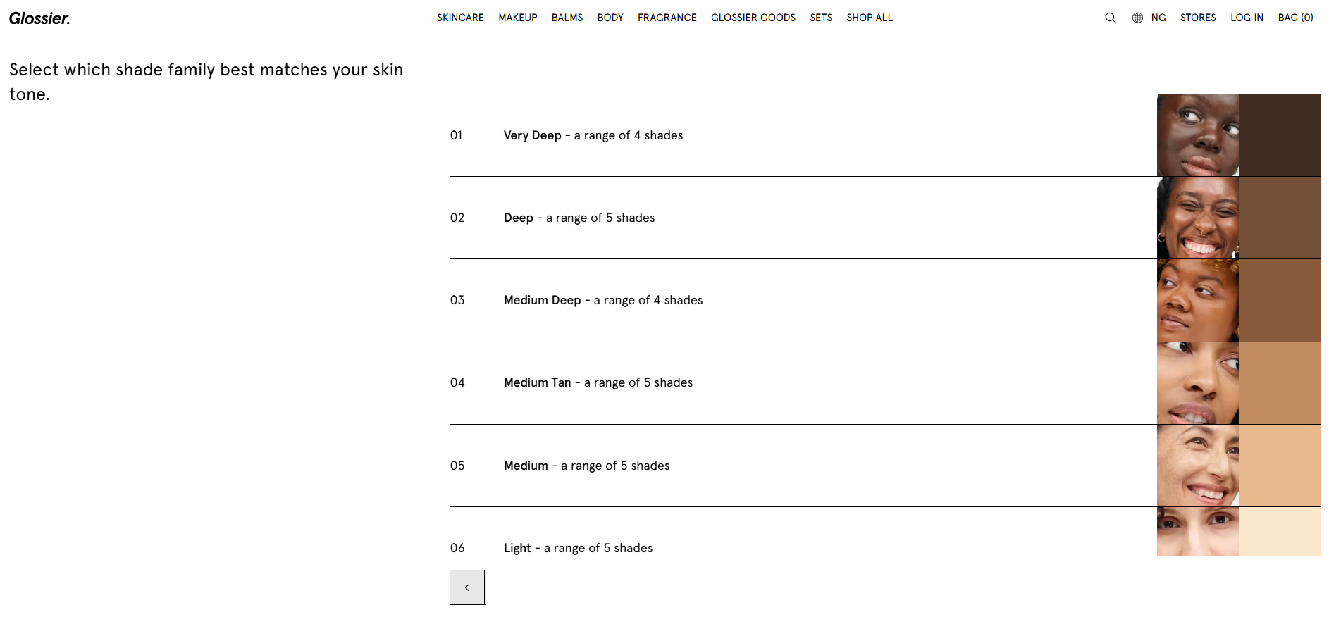
2. Make shade selection your #1 conversion priority
For color cosmetics, the biggest conversion drop-off has nothing to do with price or trust. It comes from one question visitors can't answer: "I don't know which shade is mine." Thirteen shades on a PDP mean 12 reasons not to buy, and shade uncertainty is a silent conversion killer that won't show up in your standard analytics unless you're tracking PDP exit rates by section.
Start by pulling your heatmap tool filtered for revenue impact. If your shade selection area shows high exit rates combined with high revenue correlation, that's your most important conversion lever. And the fix goes well beyond adding more swatches, because what you actually need is a complete shade selection system that removes uncertainty at every step.
A shade-finder quiz should be embedded, not buried
A shade-finder quiz should ask no more than four to five questions: undertone, current foundation shade in another brand, skin concerns, and finish preference. Keep it embedded on the PDP, not buried in a separate page where most visitors will never find it.
When quiz functionality breaks, the impact is immediate. Glossier's lip product conversion has been publicly reported to drop significantly within hours when their shade finder went down. That's how load-bearing this feature is for color cosmetics brands.
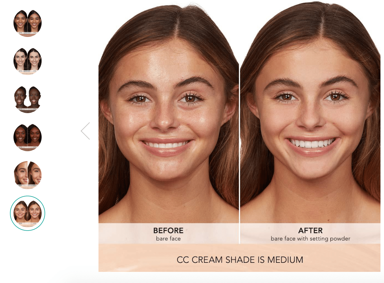
Swatch photography needs to show real skin tones
Swatch photography needs to show each shade on at least three to four skin tones: fair, medium, tan, and deep. Single-model swatch shots are one of the most common reasons shade-anxious shoppers abandon a page. Pair your swatches with skin-tone education copy directly on the PDP, and explain what "warm undertone" actually means in plain language, not industry jargon.
Thrive Causemetics executes on this well. On many of their product pages, they show before-and-after photos of their makeup on various skin colors, so shoppers can see the actual outcome on someone who looks like them. That kind of proof does more for shade confidence than any description ever could.
Shade-match social proof collapses purchase uncertainty
Pull UGC filtered by shade name and display it directly on the shade selection component. When a shopper hovering over "Shade 30N" can see three customer photos of people with similar skin tones wearing that exact shade, the uncertainty collapses. This is one of the highest-ROI placements for UGC in beauty ecommerce.
3. Use post-purchase surveys to find your blind spots
Every company thinks it knows its customers, and every company has blind spots it doesn't know about. We've seen this play out dozens of times across beauty, skincare, and prestige brands. The team is confident they understand the objections. Then the survey data comes back and reveals concerns nobody had considered.
In beauty specifically, the same objections surface over and over again when we survey customers across brands:
What happens if I have a skin reaction?
How do I know if the shade I'm seeing on the screen is accurate?
Will this color work with my skin type?
Which of these products do I apply first and last?
What are the actual ingredients?
Not having answers to these on your site doesn't just annoy visitors. It stops them from buying. And the questions above may or may not be the ones that matter most for your brand, because every company and product line generates its own set of concerns that only real customer data can reveal.
The four-question post-purchase survey
The fastest way to find your blind spots is a structured voice-of-customer research process, and it starts with a four-question post-purchase survey sent within 24 hours of delivery:
How has this product improved your life or routine? (This captures outcome language.)
What made you decide to buy from us specifically? (This captures differentiator language.)
What hesitations did you have before buying? (This captures objection language.)
What ad or content first brought you to our site? (This captures acquisition language.)
One hundred to two hundred responses is enough to identify clear patterns. You're looking for repeated phrases, specific words customers use to describe their problems, and the concerns they mention most frequently. These become the foundation for everything you write on your site.
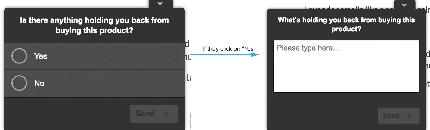
On-site polls and customer conversations still matter
Surveys aren't the only path. Using a tool like Hotjar, you can launch polls on product or cart pages that ask questions like "What's stopping you from completing your purchase right now?" or "What questions do you have about this product?" These catch objections in the moment, from people who are actively deciding whether to buy.
And don't underestimate the value of actually talking to customers. If you have retail stores, visit one, talk with the employees who interact with customers every day, and even talk with some customers directly. The way a store associate overcomes a hesitation in person often points to copy and content that's missing from your website. It may be offline, but it offers insights that translate directly to online conversion.
4. Write concern-forward copy, not ingredient-forward
Most beauty brands write copy based on industry knowledge, but customers buy based on their own vocabulary and concern hierarchy. The gap between how brands describe products and how customers think about their problems is one of the most consistent conversion killers we find in client audits.
Beauty brands default to ingredient-forward copy: "niacinamide complex," "hyaluronic acid matrix," "peptide-infused formula." But customers search for and respond to concern-forward copy: "fades dark spots," "plumps fine lines," "doesn't clog pores." The ingredient is proof, and the concern is the headline, so flip your copy hierarchy accordingly.
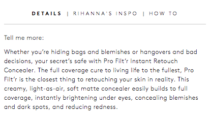
Fenty Beauty does this well with their concealer product description. Rather than leading with the formula, the copy leads with relatable use cases and outcomes, helping the customer picture themselves using the product. It describes the result first and lets the ingredients serve as the proof underneath.
This is where the survey data from the previous section becomes your most valuable asset. Once you have your VOC data, rebuild PDPs and landing pages using the exact phrases customers used, in the order they mentioned them. The most-mentioned concern becomes your headline. The most-mentioned hesitation becomes your FAQ or trust module. The most-mentioned outcome becomes your hero image alt text and meta description.
Outcome-driven product descriptions convert better than feature lists
People don't buy a concealer for the sake of buying a concealer. They buy it to feel confident, to cover up a late night, to look put-together on camera. The product is just a means to that end, and your copy should reflect that.
The best beauty product descriptions paint a picture of the result, not just the formula. They help the customer visualize what life looks like after the purchase, and they use the kind of language the customer would actually use to describe that result. When we've updated PDP copy based on this kind of research for our clients, the impact on conversions has been significant because the page finally sounds like the customer, not the brand's internal team.
5. Add clarity, don't strip information
The standard "remove all friction" advice backfires in beauty. Educated buyers, especially in skincare and prestige segments, need to feel fully informed before they'll commit to a purchase. Simplifying too aggressively signals that you're hiding something or that the product isn't sophisticated enough to warrant explanation.
When ingredient lists, usage instructions, or clinical data are removed from product pages in the name of "cleaner" design, conversion can drop meaningfully. We've seen this firsthand: when we simplified PDP content for older, more educated audience segments, conversions went down. Cluttered pages and stripped pages both hurt, but clearly organized and complete pages win.
Friction makes the purchase harder, clarity makes the decision easier
Friction is anything that makes the purchase harder without adding confidence: slow load times, confusing navigation, unclear return policies, and broken functionality.
Clarity is anything that makes the decision easier by adding relevant information, such as ingredient explanations, usage order guidance, skin-type matching, and clinical study summaries.
Never remove clarity in the name of removing friction. The rule is to improve organization, not strip information.
Quiz personalization is the clearest example. Adding a four-question skin assessment before showing product recommendations feels like "more steps," but it dramatically increases purchase confidence because the quiz makes the decision easier.
While doing conversion research for an internationally recognized cosmetics brand, we found that customers who shopped via an assisted method (quiz, shop by concern, shop by skin type) converted up to 1532% better than those who didn't. This was further validated across a dozen more brands. Customers consistently converted at much higher rates when they could filter and find the products that were right for them.
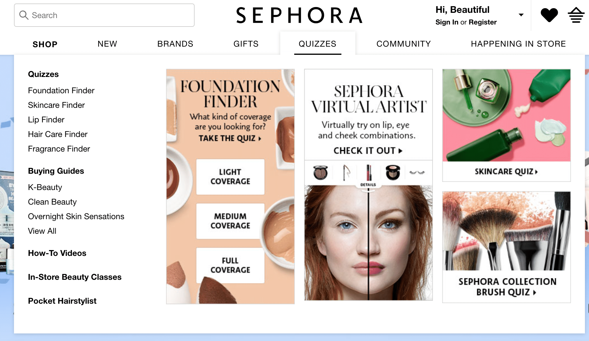
Sephora noticed this early. In their navigation menu, they offer a series of quizzes that help people find the right fragrance, foundation, lip product, and more.
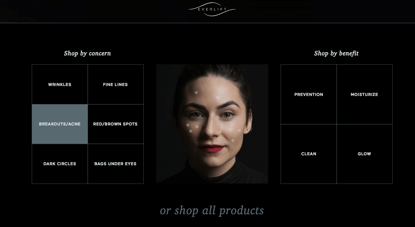
We've applied the same principle for our clients. With one brand, because we noticed their customers were very outcome-focused, we built a way for people to shop products by their skin concerns right from the navigation bar. This helps the customer navigate product lines and only see what's relevant to their skin type and desired benefit.
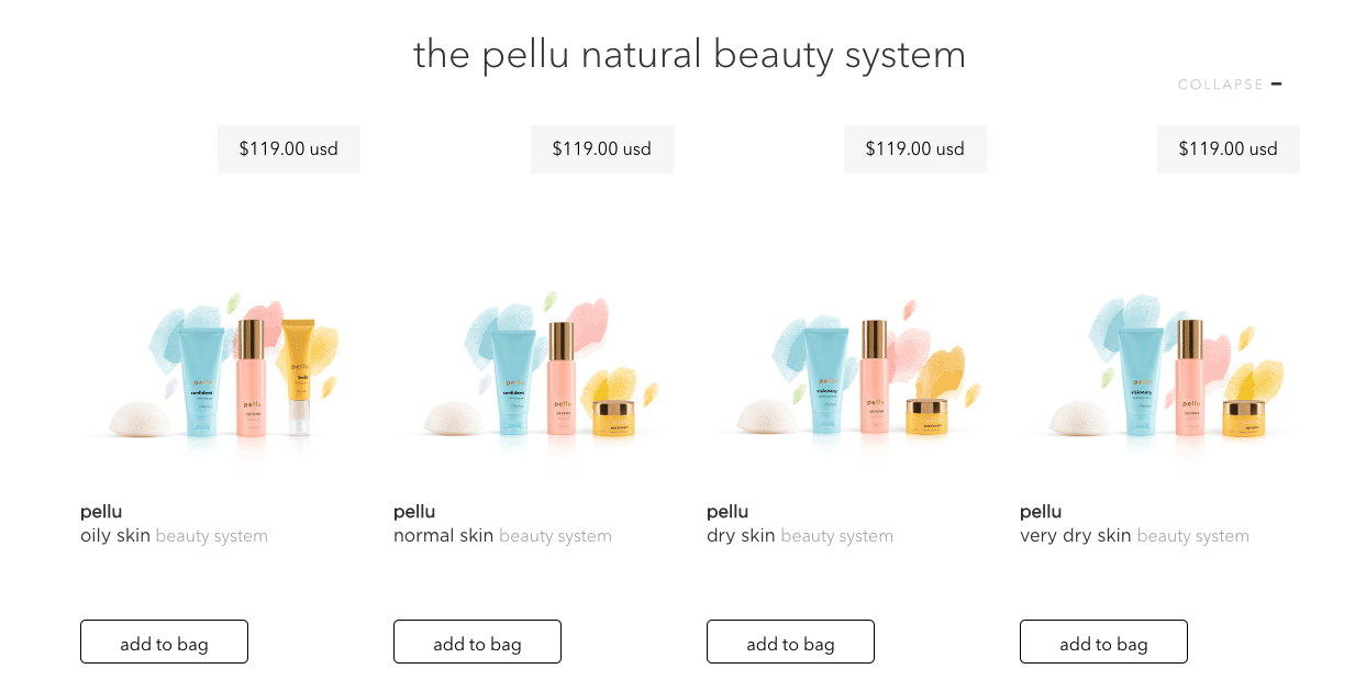
And when we designed the website for Pellu Skincare, we made sure the differences between each product bundle (differentiated by skin type) were clear on the category page, so customers could self-select before ever hitting a PDP.
The lesson is that making visitors work a little harder to get a personalized result isn't friction. It's clarity, and it converts.
6. Use bundles and subscriptions strategically
Bundles and subscriptions are two of the most reliable revenue levers in beauty ecommerce, but they don't work the same way for every product. Treating them as universal tactics is how you end up with a subscription offer on a color cosmetics PDP where the customer wants variety, or a bundle that looks great on paper but doesn't match how your customers actually shop.
Bundles work across nearly all beauty categories
If you look at how beauty products are sold offline, brands have been selling bundles forever, and for good reason. The customer gets convenience and savings, and the brand gets a higher average order value, more product discovery, and the beginning of a routine built around their products.
For ecommerce, not offering bundles often means leaving money on the table. Use your analytics to identify which products are being bought together, then test bundle options based on those patterns. Bundles are among the most reliable AOV levers in beauty, and they work across skincare, color, fragrance, and body care.
Subscriptions need to match purchase behavior
Subscriptions work for consumables with predictable usage: skincare, vitamins, daily SPF, and products where running out is inconvenient. But they can backfire for color cosmetics, where customers want to experiment and switch shades. Test subscription offers only on products with strong repurchase rates within 90 days.
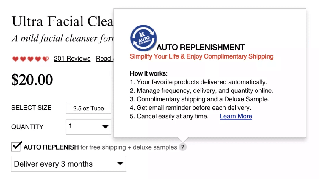
When you do offer subscriptions, the details have to be clear. Kiehl's provides a good example. Next to their "Auto Replenish" option, a question mark icon opens a window with step-by-step instructions covering how the subscription works: products arrive automatically, you can manage frequency and quantity, you get benefits like free shipping and a deluxe sample, you'll receive an email before each delivery, and you can cancel anytime.
That simple tooltip answers five common objections in one place and reduces both hesitation and support inquiries.
The important thing with both bundles and subscriptions is to measure their impact at the revenue-per-visitor level, not just conversion rate. More on that next.
7. Measure revenue per visitor, not just conversion rate
Conversion rate lies. You can lift CVR by heavily discounting, removing upsells, or simplifying to the point of stripping margin, but you'll hurt revenue while your dashboard shows green. Revenue per visitor (RPV) is the metric that catches these false positives before they damage your business.
How to calculate RPV
RPV = Total Revenue ÷ Total Visitors for the same time period. Run this calculation for your test and control groups in every A/B test. A test that increases CVR while decreasing RPV is a losing test, even if it appears to be a winner in a standard conversion report.
The most common false positives in beauty ecommerce
The false positive tests we see most often in beauty: removing bundle recommendations to "simplify" the cart page (CVR goes up, AOV craters), adding a discount pop-up (CVR goes up, margin goes down), and hiding subscription options to reduce decision complexity (CVR goes up, LTV collapses). Every one of these looks like a win in a CVR-only view. Every one of them costs the business money.
For 8 and 9-figure brands where bundles and subscriptions drive a significant share of contribution margin, RPV is the only metric that tells you the truth about whether a test is actually working.
Beauty optimization compounds when you get the sequence right
At the end of the day, you're not running a hobby website. You're running an ecommerce site that's meant to make you as much money as possible, and every element on your site can either move you closer to that goal or quietly hold you back.
The seven areas in this guide work best when they build on each other. The homepage routes visitors to the right path, shade selection removes the biggest purchase barrier, customer research gives you the language and the objections, that research drives your copy, clarity keeps educated buyers confident, bundles and subscriptions increase order value and lifetime value, and RPV keeps you honest about what's actually winning.
Frequently Asked Questions
What's the biggest mistake beauty brands make with their homepage?
Treating it like a brand showcase instead of a decision router. GA4 path analysis consistently shows that category navigation and quiz entry drive the profitable customer journeys, so your above-the-fold layout should prioritize those paths and let brand storytelling live below the fold, in About pages, and in email and social channels.
Why does simplifying beauty product pages sometimes hurt conversion?
Educated beauty buyers need detailed information to feel confident purchasing. Ingredient lists, usage instructions, and clinical data are not friction points for these shoppers. They're confidence builders. The key is organizing information clearly, not removing it.
How do you know which shade selection method works best at scale?
Track PDP exit rate by section in your heatmap tool, filtering for revenue impact. If shade selection shows high exit combined with high revenue correlation, that's your biggest lever. From there, A/B test quiz placement, swatch gallery formats, and shade-match social proof to find what moves the needle for your specific catalog and customer base.
Should every beauty brand offer subscriptions?
Not automatically. Subscriptions work for consumables with predictable usage (skincare, vitamins, daily SPF) but can backfire for color cosmetics, where customers want variety. Test subscription offers only on products with strong 90-day repurchase rates, and measure results at the RPV level so you catch any LTV trade-offs early.
What metrics actually matter for beauty ecommerce optimization?
Revenue per visitor (RPV) is the north star because it catches when CVR "improvements" actually hurt revenue. Beyond that, track homepage-to-purchase path completion rate, shade selection completion rate, and subscription take rate on eligible products.
How should beauty-specific CRO coordinate with a broader testing program?
Beauty-specific tests should be part of the same roadmap as your broader CRO testing, prioritized using the same methodology. The mistake to avoid at scale is treating shade selection optimization, subscription optimization, and homepage routing as separate workstreams with separate ownership when they share the same research base, testing platform, and operational discipline.
How do you handle the trade-off between brand presentation and conversion routing on the homepage?
The trade-off is mostly false. Strong brand presentation and effective conversion routing work together when you sequence them correctly. The above-the-fold area should prioritize routing visitors to their highest-converting paths (category navigation, quiz entry, hero product), while brand storytelling lives below the fold and in channels where the audience has already chosen to engage with your brand content.